13 Blank State Examples You Can Use to Improve User Experience During Onboarding
Share on:
Share on:
When a new user finishes onboarding and first starts to use an app, they will often see “blank state” pages. That is, pages with no activity, history or data, because it’s their first interaction with the product.
If a new user finds the blank state page intimidating it will just increase the friction and it won’t give them any reason to stick around.
There’s no one size fits all. We asked an expert how he would design the blank state pages to help users. Jon Phillips, UI designer and Developer @ UX Booth has a neat framework to deal with it:
When designing blank states I first try to come up with a list of scenarios and personas. It’s crucial to understand what users might be looking to do first when they log in to a new app or website.
If you have data to back up those scenarios or if there’s some necessary steps that need to be taken by users — like setting up an account profile — great. Then designing and writing copy can start. And it’s always better to make decisions based on actual data.
If you don’t have much data — like when designing a brand new interface or product — see if you can find data from similar applications, past projects, or other tests, then design and write copy accordingly.
The goal, I believe, is to then track usage and refine those blank states in order to properly guide users. Blank states are not a “set and forget” thing.
They always need to be refined to make sure they’re up to date and relevant.
It all depends on how tech savvy your users are, the niche of your product, how much training it takes for a new user to engage with your product and how complex your product is.
Having analyzed the pricing strategies of 100 SaaS companies, today we’re picking 13 of them to analyze their blank state pages. Having looked at all of them in details, we found eight main categories:
Dashboard filled with default data:Hubspot CRM, Acuity Scheduling
Dashboard filled with sample data: Trello, Helpscout
Tutorial: Mixpanel
Call to action: Campaign Monitor
No blank state: Kissmetrics
Hybrid: Basecamp, InvisionApp
Empty dashboard: Mailchimp, Fastspring
Everything laid out: Xero, TalentLMS
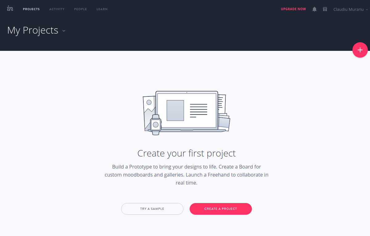
1. Dashboards filled with default data
This is the type of dashboard where default data is filled in automatically to show you the features of the app. The important thing to note is that this is data that you would actually be able to use.
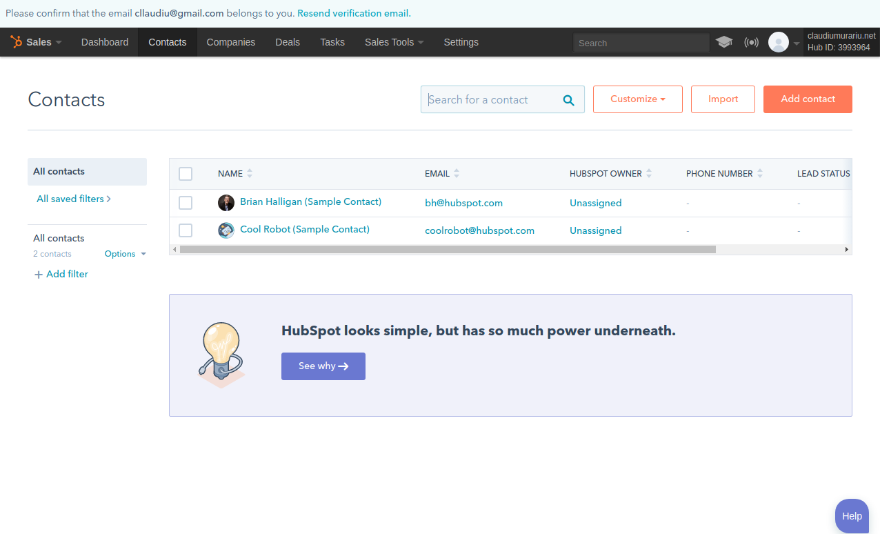
Hubspot CRM
With Hubspot CRM you get 2 contacts by default from the Hubspot Team. You can write to them, see their details and alter them just like you would do with your own contacts.
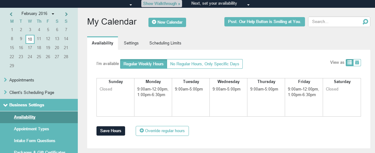
Acuity Scheduling
For Acuity Scheduling you get a week’s schedule automatically filled in to help you understand how you can organize your work week. It shows you that you can schedule a lunch break, or set yourself as not available during weekends.
2. Dashboards filled with sample data
This is very similar to the dashboards with default data but with the one key difference: you have no actual use for the sample data. You see it within the app, you see what it looks like, and then you just go ahead and delete it.
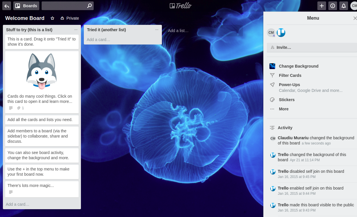
Trello
Trello created a Welcome Board for you prefilled with cards and past activity allowing you to understand how their task management system works. You can delete the whole board and create a new one from scratch.
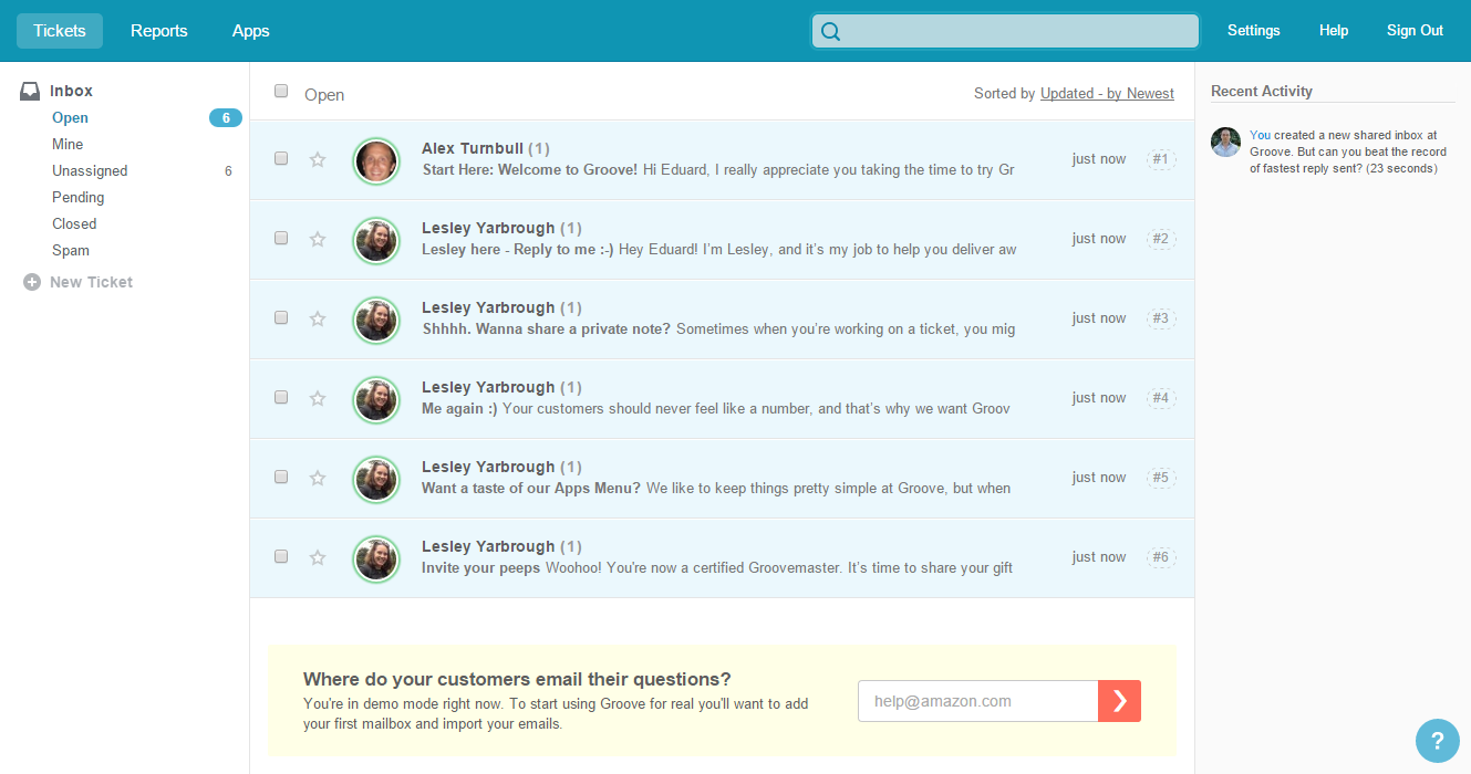
Groove
In Groove you get a couple of sample notifications from the Groove team to show you what it looks like when a customer creates a ticket.
3. Tutorial
For this type of app, the first thing you see after you register is a video tutorial showing you more info about the features of the app.
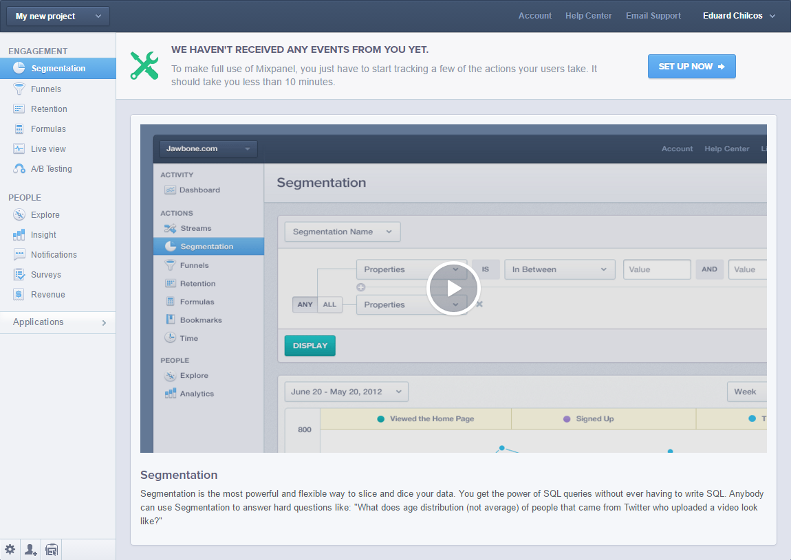
Mixpanel
In Mixpanel you see a video for every feature of the app. When you first log in you’re redirected to “Segmentation”. Each of the videos explains how the feature works, and show you how you can use it.
4. Call to action
On this type of screen, you get prompted to take the action required for you to be able to use the product.
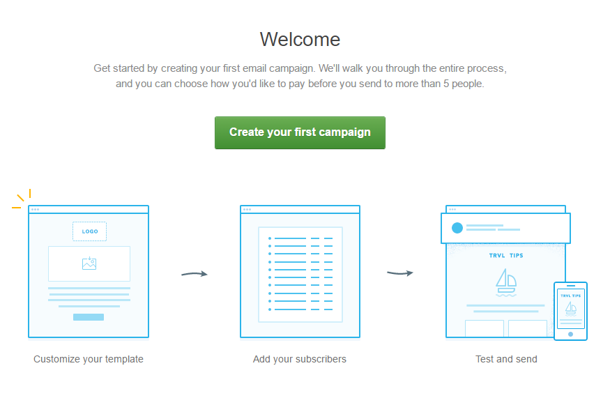
CampaignMonitor
For CampaignMonitor it means that you have to set up the first campaign. You get directed to this page which prompts you to go ahead and start creating the campaign.
5. No Blank State
This type of app doesn’t let you see the next screen unless you perform the required action.
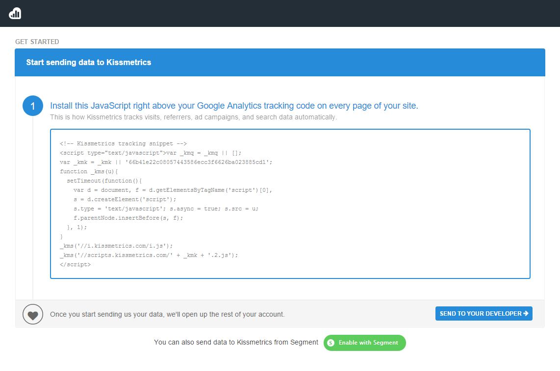
Kissmetrics
The same goes for Kissmetrics. Unless you install the code on your website, you won’t be able to get past this screen and see any features within the app.
6. Hybrid
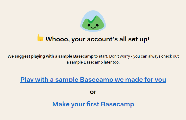
Basecamp
Basecamp is in a category of its own. The two options displayed after the onboarding is complete feature a dashboard filled with sample data and a call to action.
InVision
InVision invites you from the get going to create a project. It also gives you the ability to navigate through samples of existing projects.
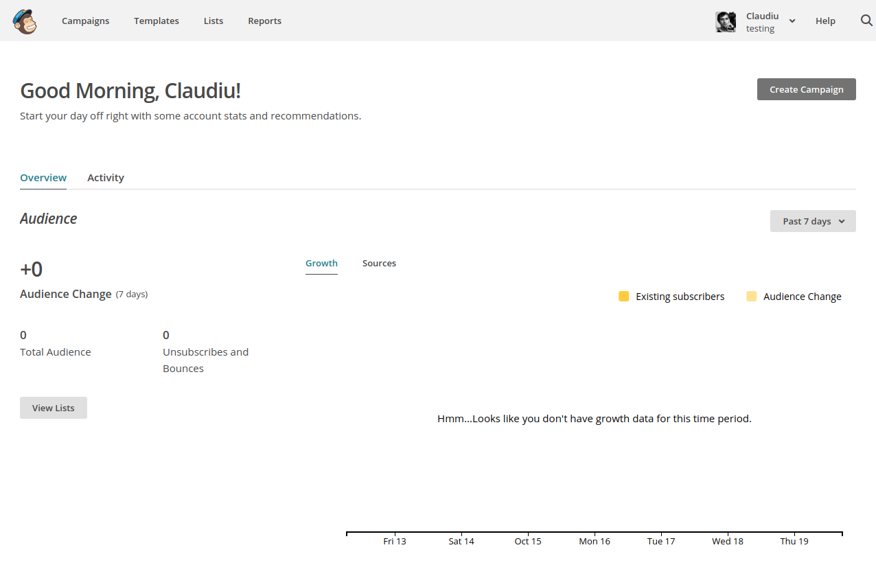
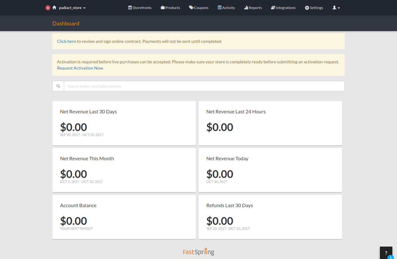
7. Empty dashboard
This is the state where the user sees the dashboard without any data. You have to take an action (i.e. implement the tracking code) before it will become awash with data.
Mailchimp
For Mailchimp this means that you would have to add subscribers and start a new campaign and the dashboard would show the data only after sending the first campaign.
FastSpring
It’s similar for FastSpring. Though you just created an account and did not do anything, the first things you get are some warning messages with what is missing from your account.
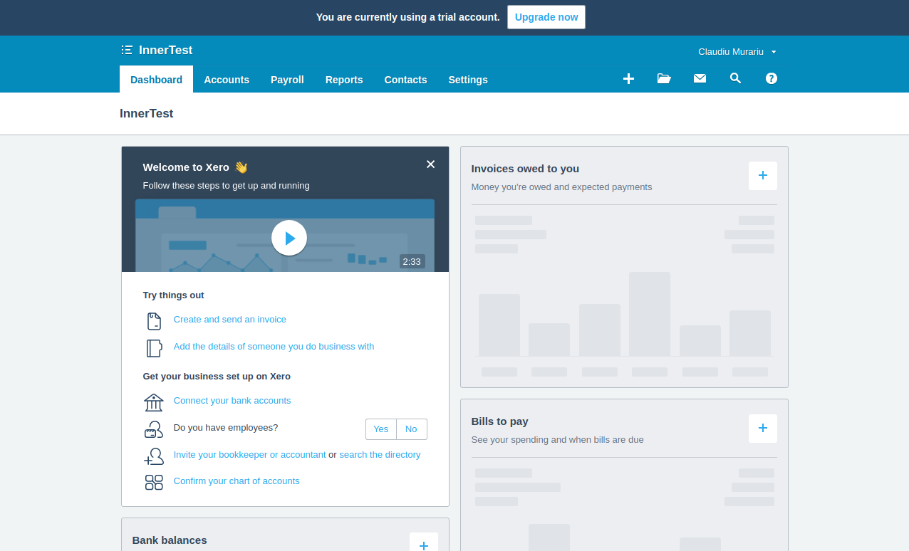
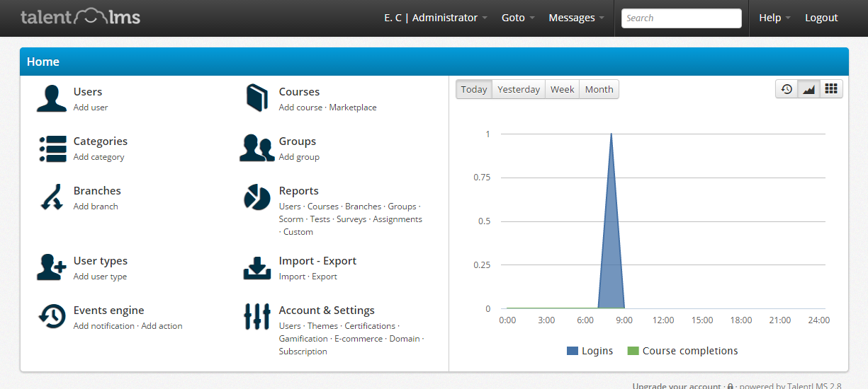
8. Everything laid out
We’ve also found a couple of products that display every single feature as soon as you finish registering for them. You are bombarded with a screen with lots of options.
This might be a bit too much for a regular user, but it’s an option that could work in a scenario where the user would receive training or view a demo prior to using the product.
Xero
This is the screen that you get to after logging in for the first time. For users that are not very accustomed to payroll and accounting, it can seem a bit overwhelming at first because you don’t know where you should click first.
TalentLMS
The same goes for TalentLMS. Even though the features are briefly explained, I’m not sure which option I should click on first.
Having seen how other SaaS companies are handling their blank page states, the next step is to go back to your own app and choose the option that makes the most sense for your product and users.
Which of the examples above closely match what you are currently serving up on your blank state pages? Or maybe you have a different example entirely? Tell us about it in the comments.
Looking for deep insights into how your customers use your product?
InnerTrends can help. You won’t have to be a data scientist to discover the best growth opportunities for your business, our software will take care of that for you.
Schedule a Demo with us and witness with your own eyes just how powerful InnerTrends can be.